Aphex, a London-based construction tech startup, stepped into a traditionally rigid industry with a mission to simplify collaboration and planning on construction sites. Unlike legacy software, Aphex aimed to be intuitive and field-first. Their USP lies in offering a live, visual, and collaborative scheduling platform tailored for boots-on-ground teams. But as a new player entering a high-friction market, they needed clarity, distinction, and memorability from day one — and that’s where our journey with them began.
SCOPE OF WORK
- Brand Identity
- Brand Strategy
- Web Design
- UX Research
The Brief.
Aphex reached out to us at a pivotal stage — a bold product
ready to launch, but lacking a brand system that truly
captured its essence and broke through the clutter of generic
construction tools. The challenge wasn’t just to create a logo
or website, but to carve a unique identity that stood apart
from conventional B2B software aesthetics.
They weren’t looking to follow industry norms — they wanted to
challenge them. The team expressed the need for a brand that
could:
- Clearly communicate what Aphex does to both technical and non-technical users
- Position them as a reliable, modern teammate, not just another SaaS tool
- Set the tone for their long-term presence, building trust from day one
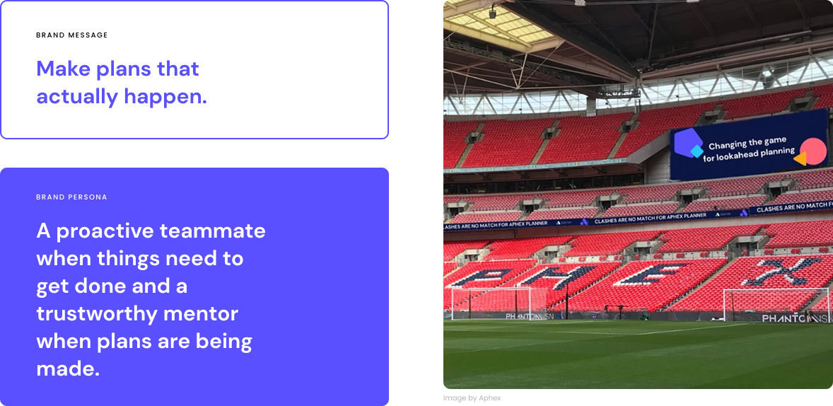
We knew we had to bridge two worlds: the analytical, data-heavy nature of planning software, and the human, day-to-day hustle of site teams. The brand had to be strategic and empathetic — just like their product.

Brand Strategy.
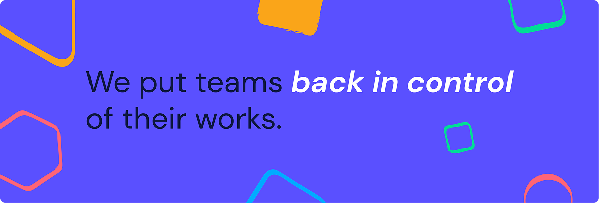
We anchored Aphex’s brand strategy in two pillars: Empathy for the field and Clarity in chaos. Knowing their users juggle high-stress environments, we built a strategy that made every brand element — from the first tagline to UI tooltips — feel like it was designed by someone who’s "been there." Rather than lean on corporate tropes, we leaned into familiarity, trust, and empowerment. The result? A brand that doesn't scream software — it speaks human.
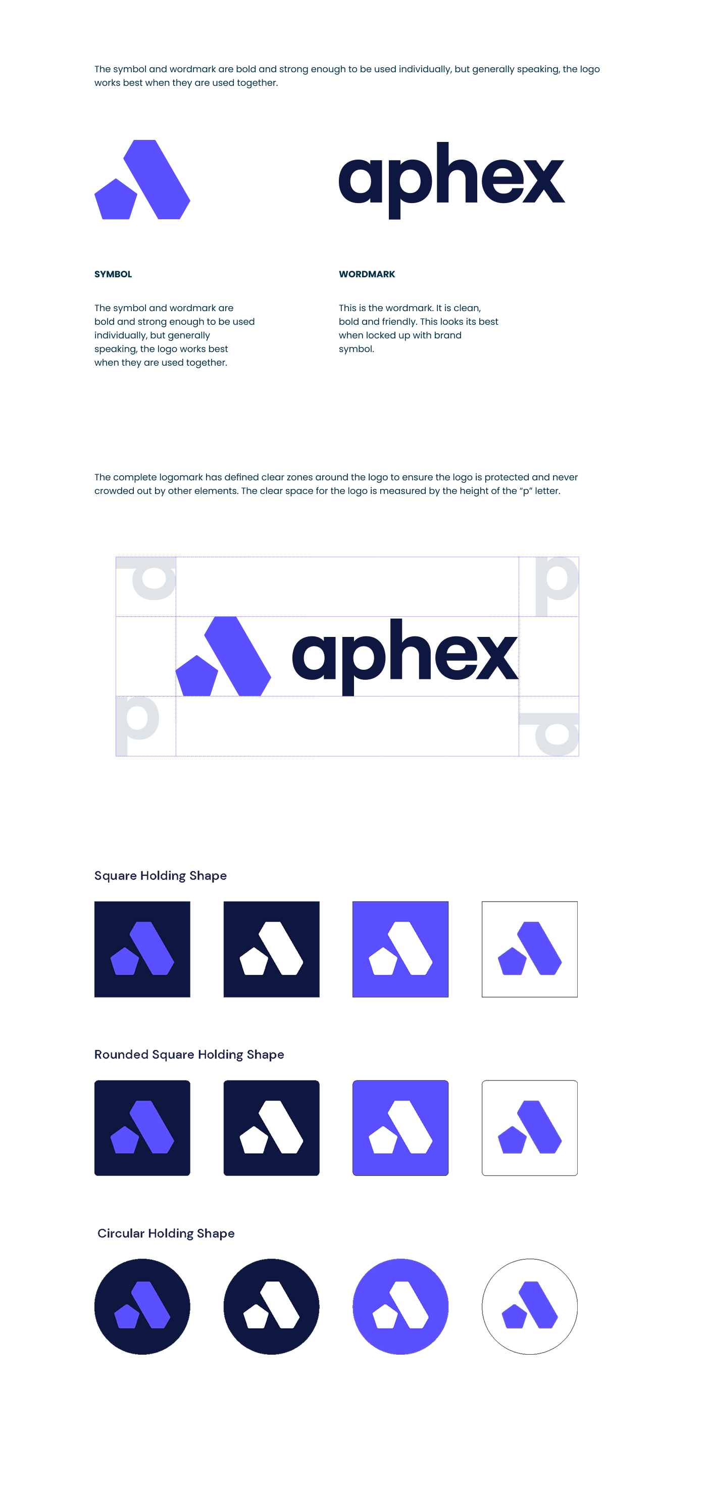
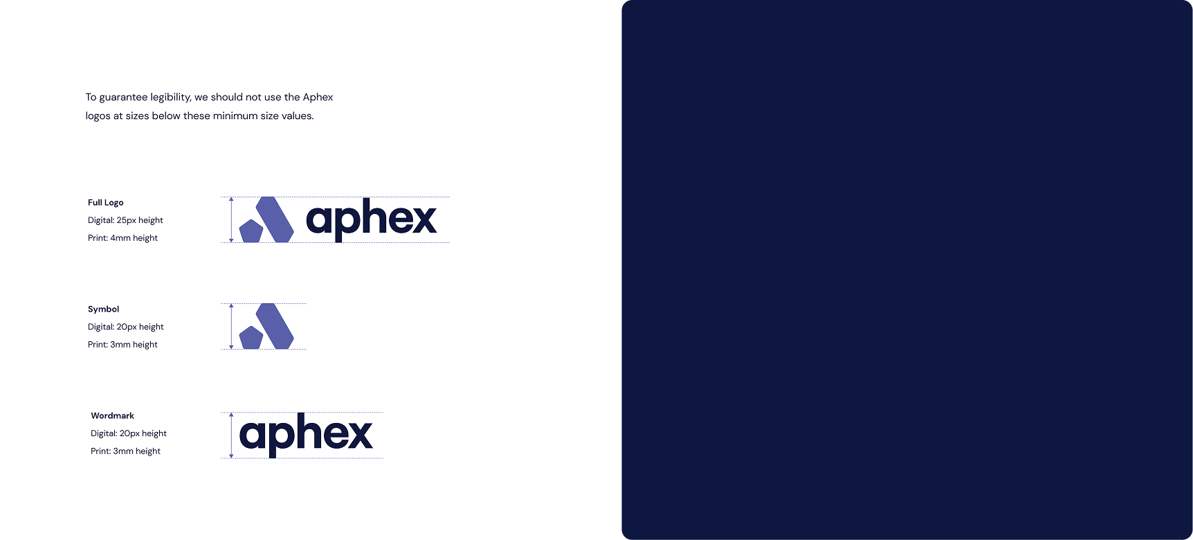
Logo.
The Aphex logo strikes a balance between modernity and structure. The abstract “A” formed from geometric angles subtly nods to planning grids and construction forms, while the pentagon serves as a grounding shape. The Neon Blue makes it pop — signaling clarity, visibility, and modern thinking in a traditional space.
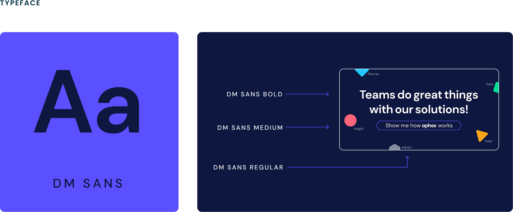
Typography.
DM Sans was chosen for its clarity, balance, and warmth. It offers geometric precision without losing human friendliness — ideal for construction teams needing fast readability in high-focus environments. Its lowercase style and open counters reflect the brand’s accessible and non-intimidating voice.
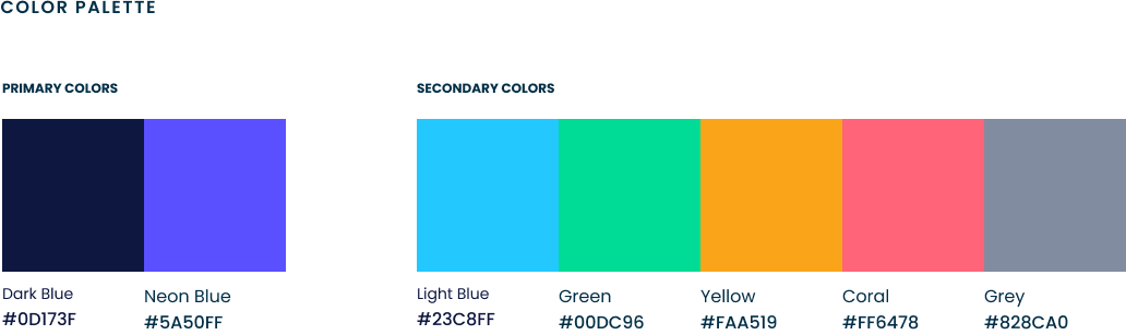
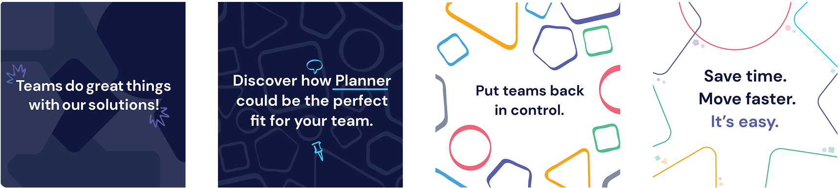
Brand Palette.
Aphex’s brand palette centers around Neon Blue and Dark Blue, symbolizing precision and trust. These are supported by a playful yet balanced secondary palette — Light Blue, Green, Yellow, Coral — that adds personality without overwhelming. The use of 30% opacity shades creates a layered, scalable visual system adaptable for product UI and marketing alike.
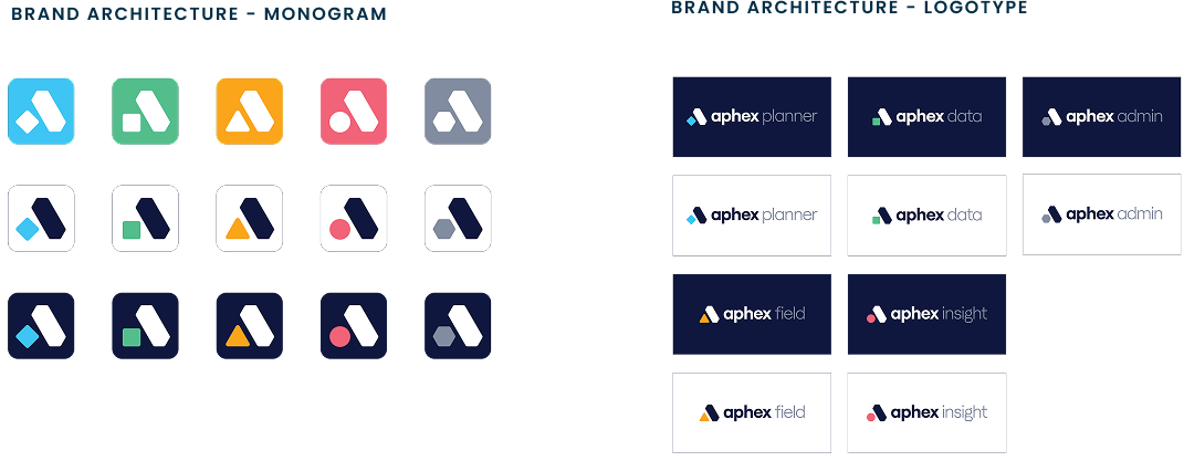
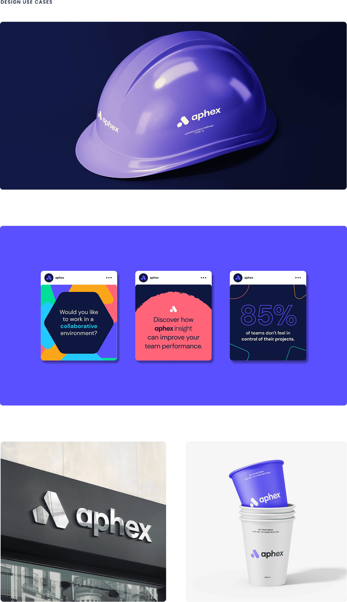
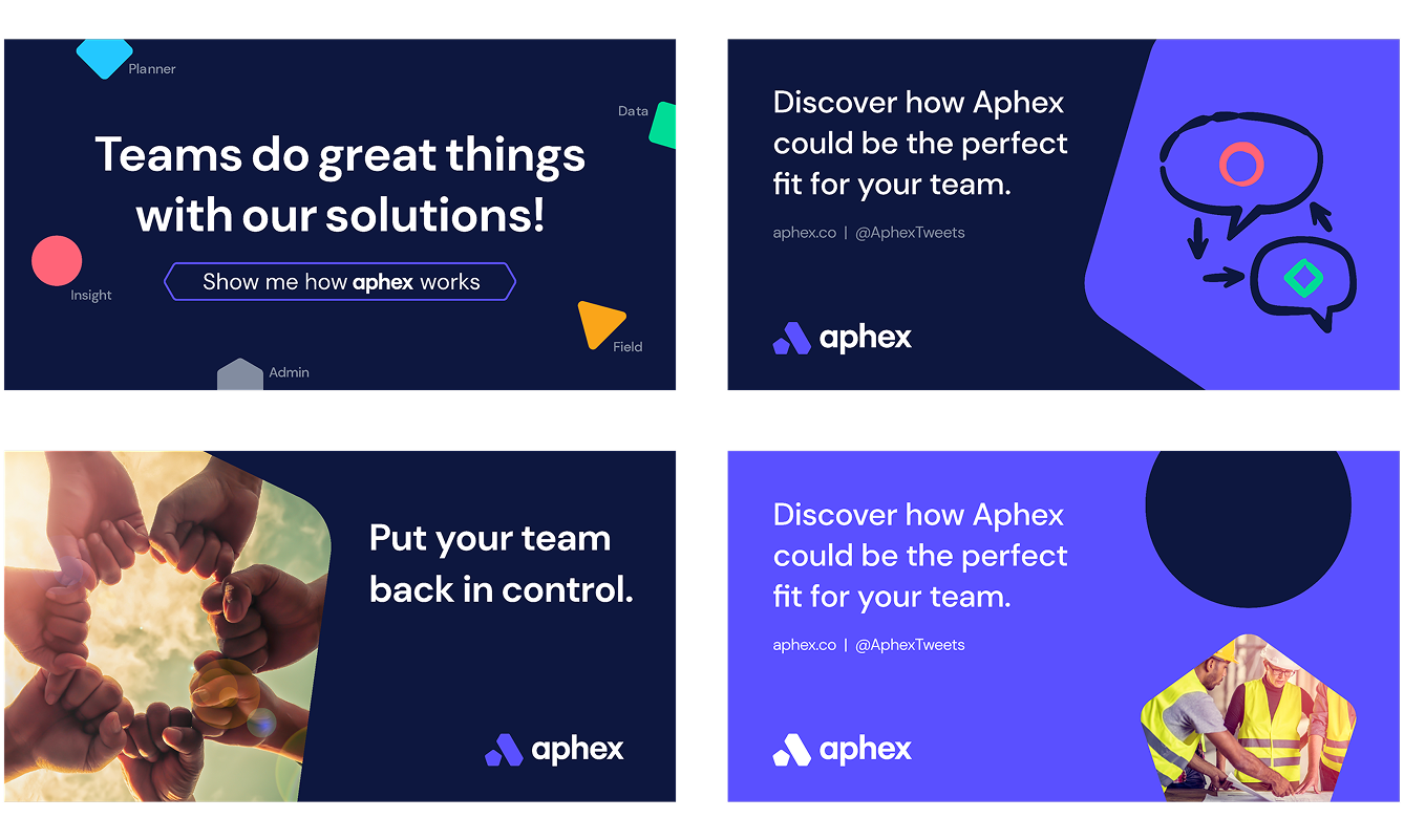
Brand Patterns and Illustrations.
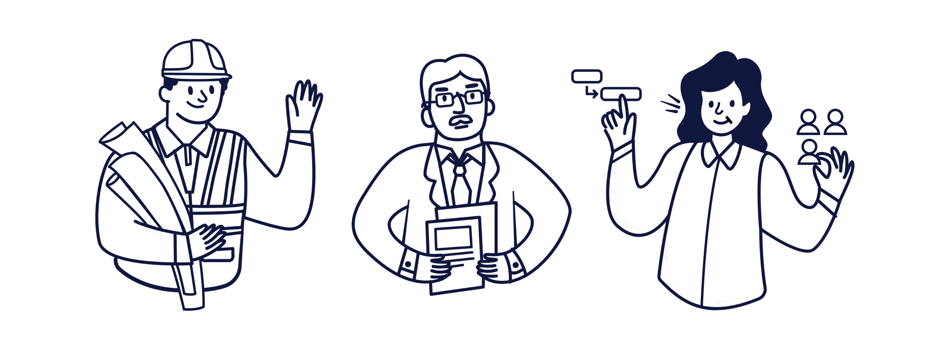
The system of geometric shapes squares, circles, pentagons, hexagons are not just decorative. They mirror the modular nature of planning and coordination in construction. Combined with hand-drawn style iconography, it adds a human touch, a balance of order and real-world imperfection that site teams relate to.
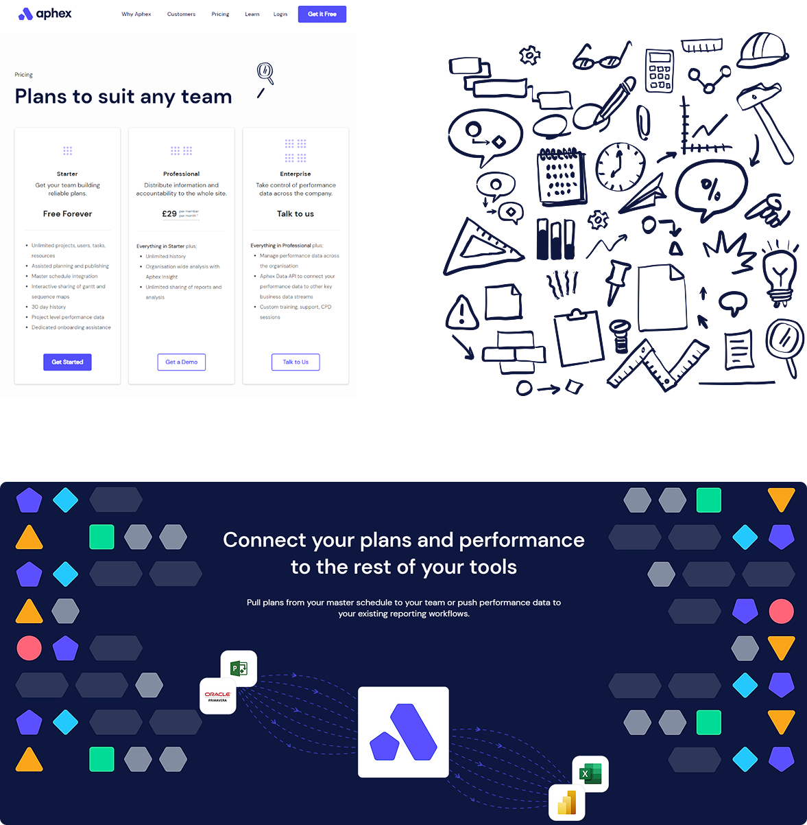
Web Design.
The website was more than a digital brochure — it was built as a
product experience. Clear UX hierarchies, engaging CTAs,
interactive elements, and a refined structure guided users through
the value proposition without fluff. Performance, accessibility,
and visual design were equally prioritized — resulting in both
higher retention and better SEO signals. Our UX research uncovered
a key insight: site teams often feel
overwhelmed by too many inputs. So we created a design system that grouped information
contextually, allowed interaction flexibility, and offered
guidance without being intrusive.
The result? A UI that lets users “control the chaos” — not just
navigate it.
Post Branding.
The rebrand did more than just look good — it worked. Within six months:
- Average website browsing time surged by 400%
- User onboarding conversions saw a 1200% growth
- Early users were able to explain what Aphex does in simpler terms — increasing word-of-mouth traction
- The client dashboard became a benchmark for intuitive UI in construction tech
But perhaps more importantly, the Aphex brand earned immediate trust. Their voice resonated with site teams, and their visuals felt like a breath of fresh air in a sea of outdated dashboards. It wasn't just a launch, it was a breakout.